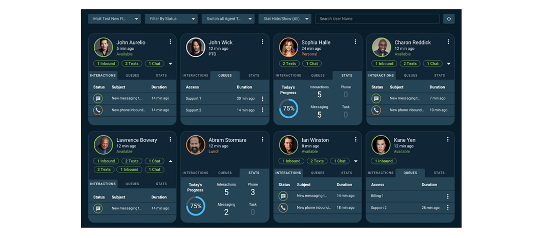
UI/UX Team View Dashboard
The dashboard gives customer success managers a real-time view of their team’s workload and activity. At a glance, they need to understand who is available, how many customers their team is engaging with, and the types of interactions taking place.
The client wanted to modernize the experience while making the existing information easier to scan and understand. The redesign focused on creating clearer visual hierarchy, improving the organization of information, and helping managers quickly identify what needed their attention.
BEFORE:
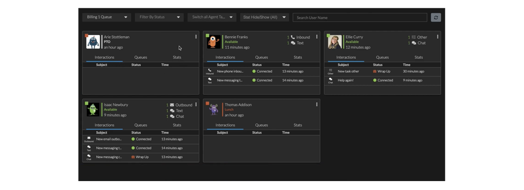
AFTER: